Take a number of shots using lines to create a sense of depth.
Now take a number of shots using lines to flatten the pictorial space.
Now take a number of shots using lines to flatten the pictorial space.
Starting Approach
I like lines. Before this exercise taught me why they work so well, I had a tendency of incorporating them by default into my photos, it is now nice to know why. For this exercise I decided to go for a walk to see what type of lines I could capture.
A link to the contact sheet is here: exercise_1.3_contact_sheet.pdf
Review
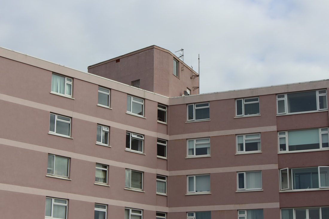
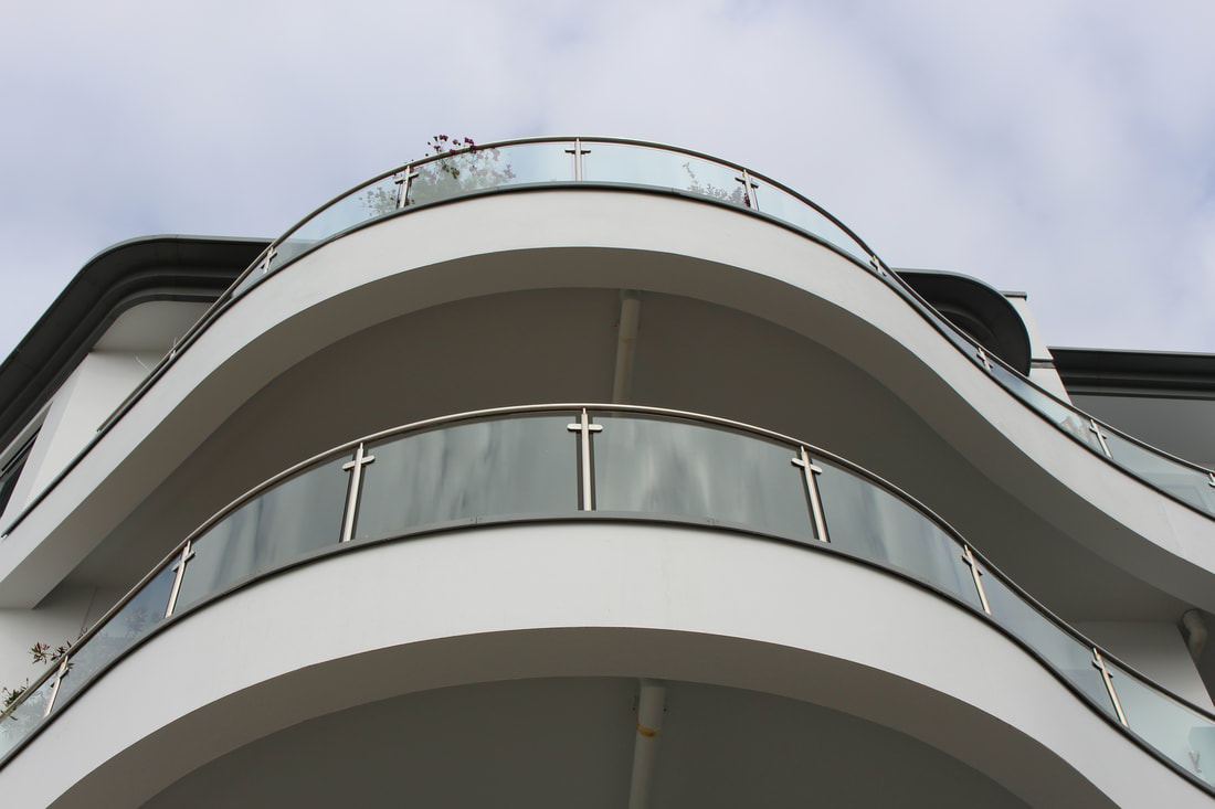
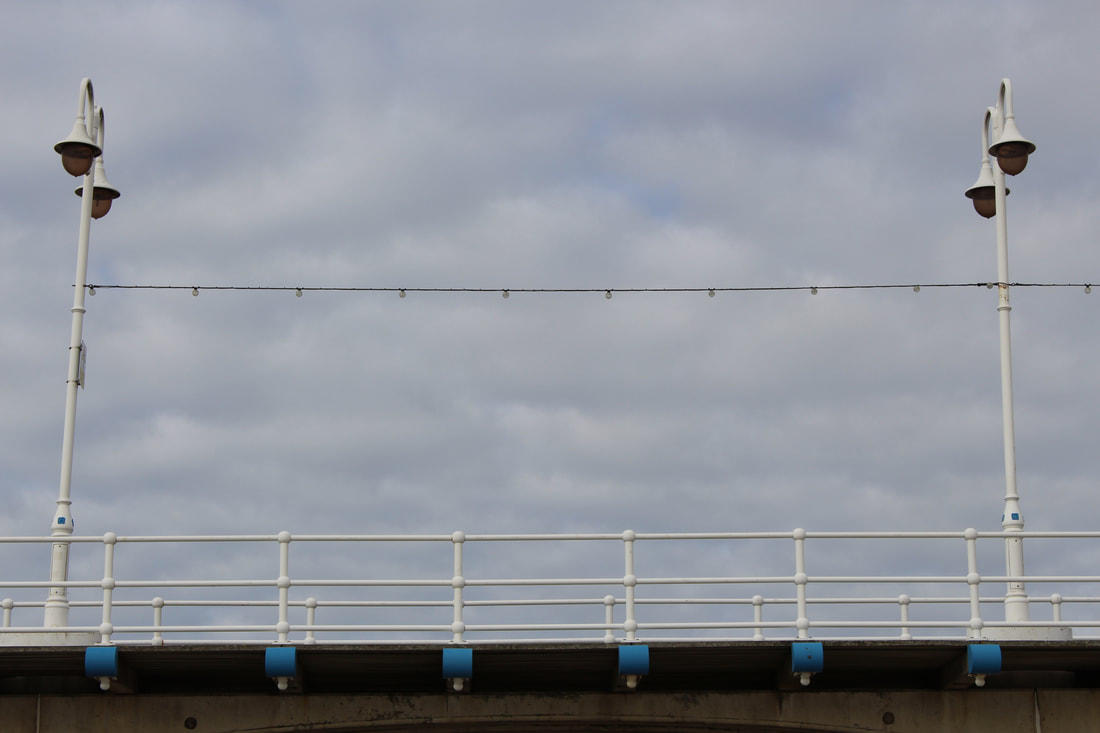
Image 6357
The eye is drawn tot he centre, as it is delineated, it makes the items on the side feel like noise.
Image 6358
A stronger photo, nothing to break the lines.
Image 6359
Needs cropping, not too sure what it would be like after.
Image 6360/61
6361 is the stronger photo as the railings are straighter. In 6360 the railings make you feel like you are failing into the photo slightly.
Image 6362/6363
Strong lines, it would be nicer to get more into focus.
Image 6364
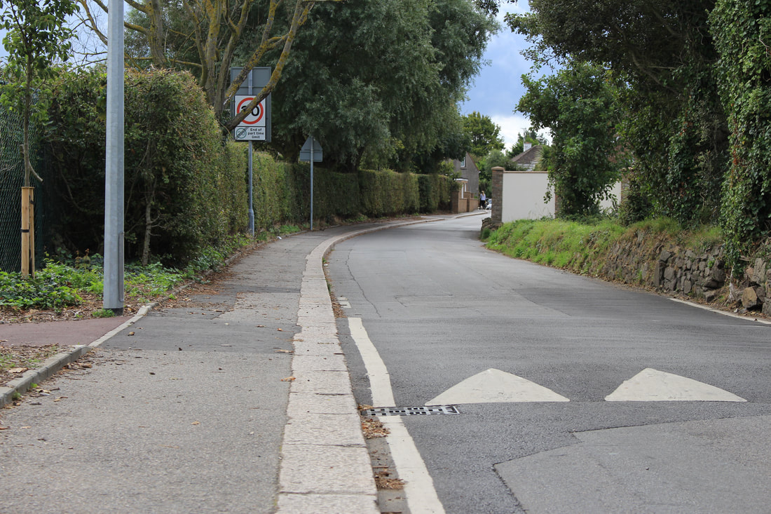
The curved line of the pavement and road do work here. The eye is taken to the woman at the end. I don't like random people in my photos and I was waiting for her to get out of the shot, however I am very glad she is in it, as it give the photo some perspective. She may even be a "point"!
Image 6367/6368
I prefer 6368 as it appears cleaner. 6367 is ok, but I am not sure.
Image 6369
Fail. I was attempting to capture the curve, however I photographed it too flat on.
Image 6370
It looks like it contains a flash reflection, I am not too sure if that's possible. I scream for the photo to be dead on, but off centre can be as good. I think it is a good photo composition that could be taken better. I will revisit the location.
Image 6371
The eye is certainly taken down the centre, ignoring all at the sides.
Image 6372
The eye is taken around the curve, although it also highlights the out of focus nature of the distance. Would it be possible to get it all in focus?
Image 6373
Strong lines, both of the barrier and the horizon.
Image 6374
It doesn't work as well and I don't know why. The barrier almost feels too short in the picture.
Image 6375/76
Strong images, 6376 more so, cutting out the foreground seems to make it stronger.
Image 6377
The foreground being present in this is ok. Is it due to the evening up of the sky and ground, top and bottom?
Image 6378
The lines work well. They are strong and also add/provide depth.
Image 6379/80
6379 feels the better composed shot, 6380 feels too busy. Neither help describe the brief.
Image 6381/82
Lines created by nature. I prefer 6381, there is more to read as you are reading left to right. Likewise the red jacket givens an area of focus, another "point"!
Image 6383/6384
The framing in 6384 is better, a clearer bottom to the subject matter (the fence), it makes it stand out more and gives a cleaner feel.
Image 6385/86
I was trying to use the speed sign as a point. Again the eye travels down the curve of the road. The edge of the car in 6385 gives some sense of motion/movement.
Image 6387
The lines are complementary and the soft curve takes the eye throughout the photo.
Image 6388
The strong line is aided by the almost black and white nature of this photo.
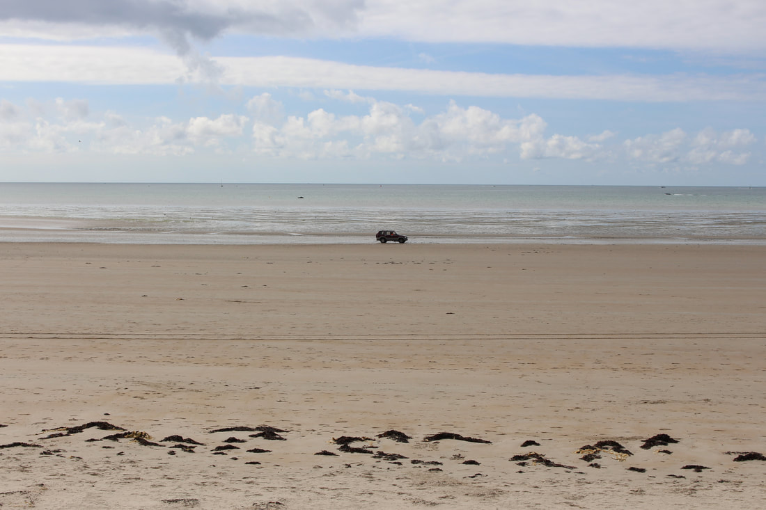
Image 6389/90/91
I tried to capture both the line and the curve on the same shot. 6391 feels over exposed, check the histogram (comparing the histogram for 6391 to 6390, the curve is more towards the white end, which gives rise to another learning point to investigate, at what point in the curve are things deemed to be "overexposed"....) I prefer image 6390, the greater foreground makes it feel more balanced. The navigational marker gives some interest (another point?)
Image 6392
A nice symmetry of lines between the horizon and wall. The foreground gives some interest/contrast/perspective.
Image 6393
The sudden emergence of the wall from the sand appeals, with no formal beginning/end, almost a natural spawning. I hate the tower blocks in the background. I want to airbrush/obliterate. I have to accept that nature/life/reality will not always pander to my OCD sensibilities.
Image 6394
I tried to cut out the offending tower blocks, however it is a poorer photo. The wall feels too close to the edge. Is it because the wall is on the golden section in 6393?
Image 6395
Good strong lines.
Image 6396
Nice photo but....is it because there is nothing to grab the attention in the centre, i.e. the eye is drawn to the a space of emptiness.
Image 6397
Needs straightening. Does the brickwork make it too busy?
Image 6398
Feels a stronger composed photo.
Image 6399
Nice soft curves, nice symmetry.
Image 6400/01/02
I tried to capture the vertical lines, however the end point had a noisy/detracting background.
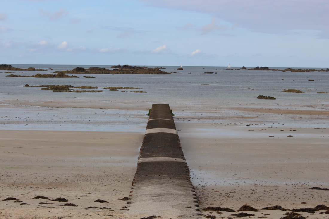
Image 6403
Imposing strong lines, but I have cut out the top corner. Rookie mistake.
Image 6404
A nice curve, again need to look at depth of field/focusing.
Image 6406/07/08
6406 is cleaner. In 6407 the eye is drawn to the bin, this is ok, however I would need to frame it better if that is the intention, also the top of the stairs appears out of focus. 6408 the handrail gives a strong line, likewise the wire running perpendicular, however this photo does not grab me, I think it is because of the deadening dull monochrome grey sky.
Image 6409
Nice colour contrast. Along with the intersecting lines there is an appealing mixture of textures.
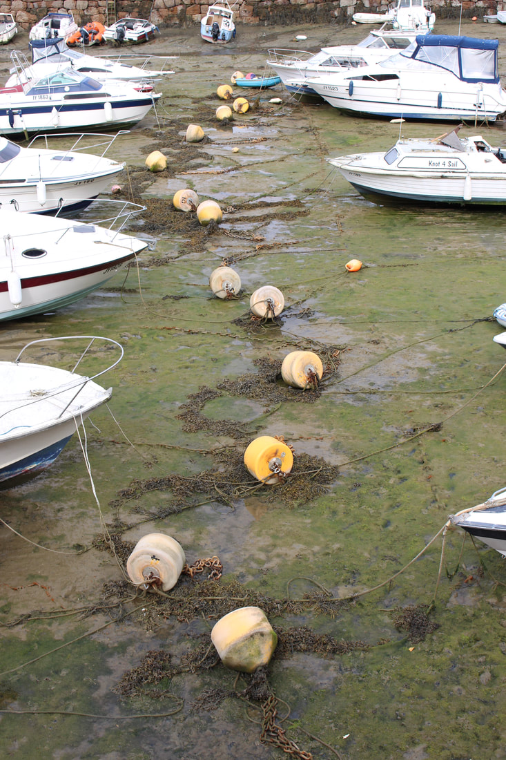
Image 6410
The bouys produce a nice curved line.
Image 6411/12
6412 is the cleaner image, it gives a flatter stronger picture. In image 6411 the non-straight unevenness of the bottom whilte lines, which is also broken by trees is distracting.
Image 6413/6414
6414 is in better focus.
Image 6415
When taking this photo I never spotted the foragers. The colours are appealing, although now the people catch my eye too much.
Image 6416
This is cleaner, no distractions. Should it be more half and half between the pool and the gullies in the seaweed?
Image 6417
It needs to cropped to get rid of the pool wall. The gullies do take the eye in, but to what is the question...
Image 6418/19
6419 is the better photo. The parallel line on the left adds tot he pattern and the lower perspective also assists.
Image 6420/21
I am not too sure which one works better. The different texture in the foreground of 6420 gives it another element, 6420 is cleaner, it pulls the eye into the sea quicker.
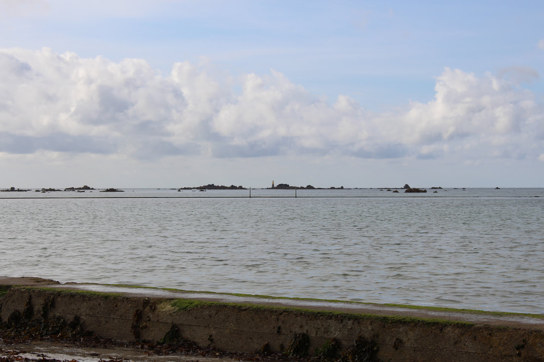
Image 6424
Using the signs as "points".
Image 6425/26
6425 is straighter. The horizon is also higher, give a nicer proportion balance to the different sections. The car also gives a focus.
Image 6427/28/29
I was trying to capture a curve with the racing cars. 6428 probably does this the best. However it only takes the eye around a small part of the photo, leaving a lot of dead/unseen space.
Image 6430
This is the same as 6424 but without the car. Probably more traditional "points", i.e. the car naturally linked them in 6424 however on this photo it could be argued that the subject matter is the bay however the eyes keep on jumping between the signs.
Image 6431/32
I tried to capture the curve along the bay. Fail. There is not a strong enough connecting line to carry the eye around.
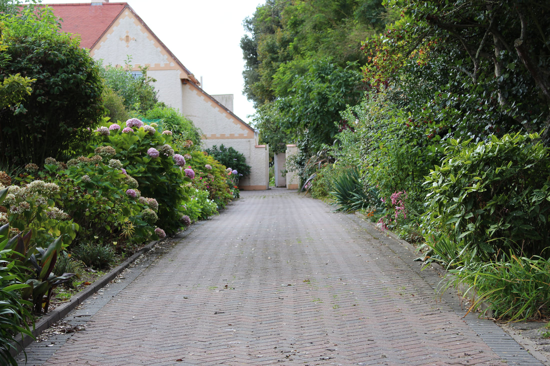
Image 6433/34/35
Not enough depth of field, so the item the eye is drawn to screams of being out of focus. The portrait in 6435 is the better format, as it means the proportions of the grass either side of the path are more pleasing.
Image 6436/37
Again trying to capture the curve. This time it works better a there is a stronger more consistent line present to pull the eye around.
Image 6445/46
Strong lines, I think both orientations work.
Image 6452
Nice curving steps.
Image 6357
The eye is drawn tot he centre, as it is delineated, it makes the items on the side feel like noise.
Image 6358
A stronger photo, nothing to break the lines.
Image 6359
Needs cropping, not too sure what it would be like after.
Image 6360/61
6361 is the stronger photo as the railings are straighter. In 6360 the railings make you feel like you are failing into the photo slightly.
Image 6362/6363
Strong lines, it would be nicer to get more into focus.
Image 6364
The curved line of the pavement and road do work here. The eye is taken to the woman at the end. I don't like random people in my photos and I was waiting for her to get out of the shot, however I am very glad she is in it, as it give the photo some perspective. She may even be a "point"!
Image 6367/6368
I prefer 6368 as it appears cleaner. 6367 is ok, but I am not sure.
Image 6369
Fail. I was attempting to capture the curve, however I photographed it too flat on.
Image 6370
It looks like it contains a flash reflection, I am not too sure if that's possible. I scream for the photo to be dead on, but off centre can be as good. I think it is a good photo composition that could be taken better. I will revisit the location.
Image 6371
The eye is certainly taken down the centre, ignoring all at the sides.
Image 6372
The eye is taken around the curve, although it also highlights the out of focus nature of the distance. Would it be possible to get it all in focus?
Image 6373
Strong lines, both of the barrier and the horizon.
Image 6374
It doesn't work as well and I don't know why. The barrier almost feels too short in the picture.
Image 6375/76
Strong images, 6376 more so, cutting out the foreground seems to make it stronger.
Image 6377
The foreground being present in this is ok. Is it due to the evening up of the sky and ground, top and bottom?
Image 6378
The lines work well. They are strong and also add/provide depth.
Image 6379/80
6379 feels the better composed shot, 6380 feels too busy. Neither help describe the brief.
Image 6381/82
Lines created by nature. I prefer 6381, there is more to read as you are reading left to right. Likewise the red jacket givens an area of focus, another "point"!
Image 6383/6384
The framing in 6384 is better, a clearer bottom to the subject matter (the fence), it makes it stand out more and gives a cleaner feel.
Image 6385/86
I was trying to use the speed sign as a point. Again the eye travels down the curve of the road. The edge of the car in 6385 gives some sense of motion/movement.
Image 6387
The lines are complementary and the soft curve takes the eye throughout the photo.
Image 6388
The strong line is aided by the almost black and white nature of this photo.
Image 6389/90/91
I tried to capture both the line and the curve on the same shot. 6391 feels over exposed, check the histogram (comparing the histogram for 6391 to 6390, the curve is more towards the white end, which gives rise to another learning point to investigate, at what point in the curve are things deemed to be "overexposed"....) I prefer image 6390, the greater foreground makes it feel more balanced. The navigational marker gives some interest (another point?)
Image 6392
A nice symmetry of lines between the horizon and wall. The foreground gives some interest/contrast/perspective.
Image 6393
The sudden emergence of the wall from the sand appeals, with no formal beginning/end, almost a natural spawning. I hate the tower blocks in the background. I want to airbrush/obliterate. I have to accept that nature/life/reality will not always pander to my OCD sensibilities.
Image 6394
I tried to cut out the offending tower blocks, however it is a poorer photo. The wall feels too close to the edge. Is it because the wall is on the golden section in 6393?
Image 6395
Good strong lines.
Image 6396
Nice photo but....is it because there is nothing to grab the attention in the centre, i.e. the eye is drawn to the a space of emptiness.
Image 6397
Needs straightening. Does the brickwork make it too busy?
Image 6398
Feels a stronger composed photo.
Image 6399
Nice soft curves, nice symmetry.
Image 6400/01/02
I tried to capture the vertical lines, however the end point had a noisy/detracting background.
Image 6403
Imposing strong lines, but I have cut out the top corner. Rookie mistake.
Image 6404
A nice curve, again need to look at depth of field/focusing.
Image 6406/07/08
6406 is cleaner. In 6407 the eye is drawn to the bin, this is ok, however I would need to frame it better if that is the intention, also the top of the stairs appears out of focus. 6408 the handrail gives a strong line, likewise the wire running perpendicular, however this photo does not grab me, I think it is because of the deadening dull monochrome grey sky.
Image 6409
Nice colour contrast. Along with the intersecting lines there is an appealing mixture of textures.
Image 6410
The bouys produce a nice curved line.
Image 6411/12
6412 is the cleaner image, it gives a flatter stronger picture. In image 6411 the non-straight unevenness of the bottom whilte lines, which is also broken by trees is distracting.
Image 6413/6414
6414 is in better focus.
Image 6415
When taking this photo I never spotted the foragers. The colours are appealing, although now the people catch my eye too much.
Image 6416
This is cleaner, no distractions. Should it be more half and half between the pool and the gullies in the seaweed?
Image 6417
It needs to cropped to get rid of the pool wall. The gullies do take the eye in, but to what is the question...
Image 6418/19
6419 is the better photo. The parallel line on the left adds tot he pattern and the lower perspective also assists.
Image 6420/21
I am not too sure which one works better. The different texture in the foreground of 6420 gives it another element, 6420 is cleaner, it pulls the eye into the sea quicker.
Image 6424
Using the signs as "points".
Image 6425/26
6425 is straighter. The horizon is also higher, give a nicer proportion balance to the different sections. The car also gives a focus.
Image 6427/28/29
I was trying to capture a curve with the racing cars. 6428 probably does this the best. However it only takes the eye around a small part of the photo, leaving a lot of dead/unseen space.
Image 6430
This is the same as 6424 but without the car. Probably more traditional "points", i.e. the car naturally linked them in 6424 however on this photo it could be argued that the subject matter is the bay however the eyes keep on jumping between the signs.
Image 6431/32
I tried to capture the curve along the bay. Fail. There is not a strong enough connecting line to carry the eye around.
Image 6433/34/35
Not enough depth of field, so the item the eye is drawn to screams of being out of focus. The portrait in 6435 is the better format, as it means the proportions of the grass either side of the path are more pleasing.
Image 6436/37
Again trying to capture the curve. This time it works better a there is a stronger more consistent line present to pull the eye around.
Image 6445/46
Strong lines, I think both orientations work.
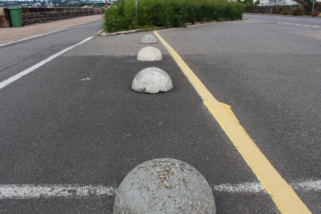
Image 6452
Nice curving steps.
Chosen images
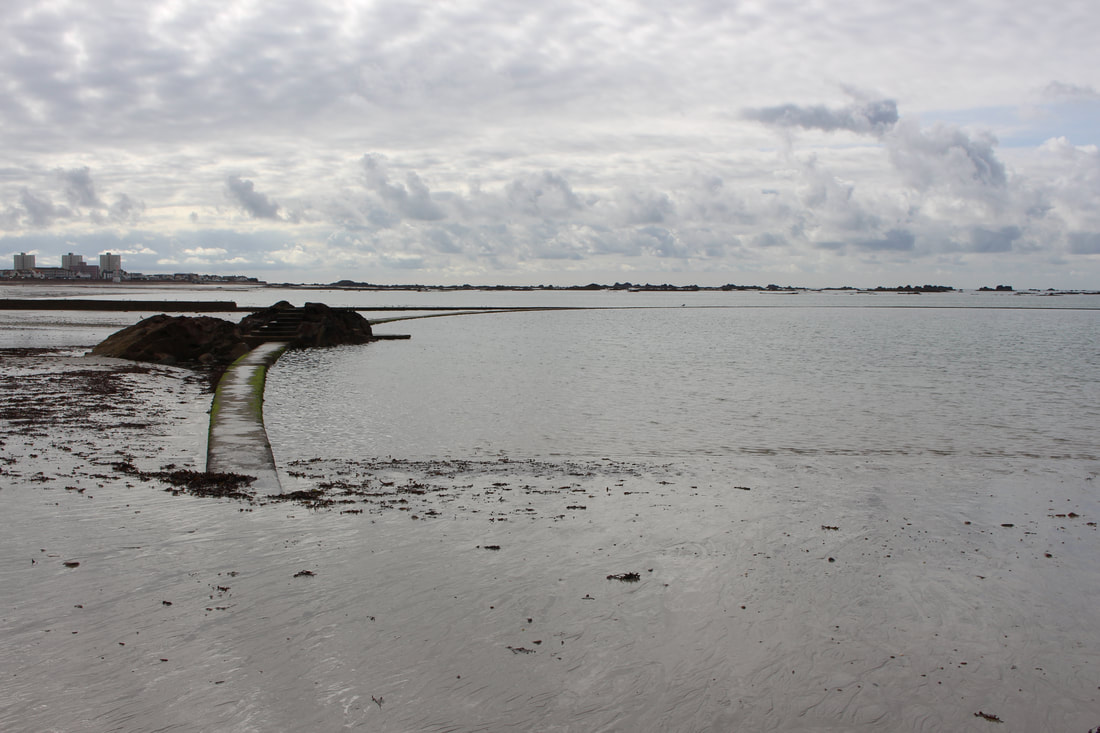
Curved lines
Curved lines
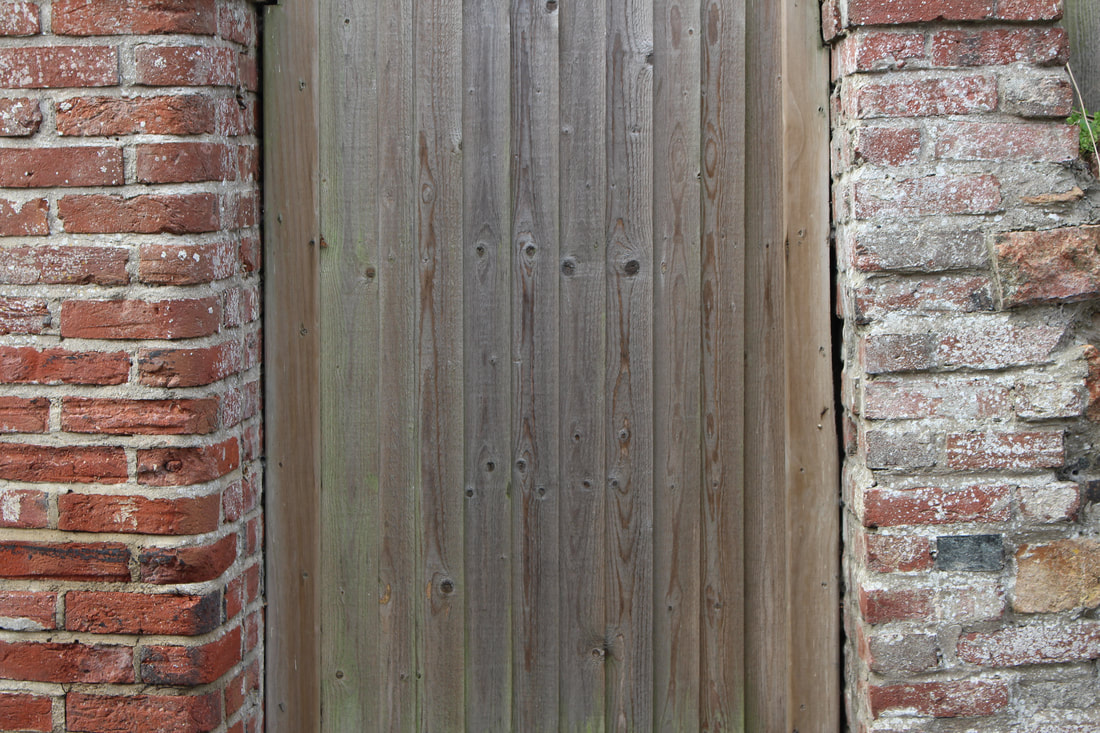
Vertical lines
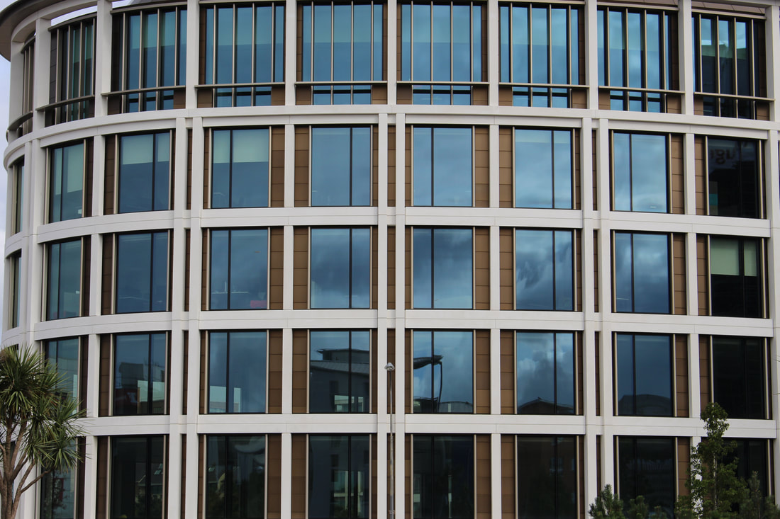
Horizontal lines
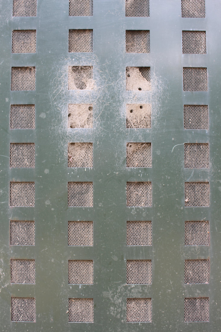
Flat
Leading line